Improving a website’s speed and user experience often starts with optimizing the most prominent and visually intensive elements — and nothing fits that bill quite like a homepage hero slider. Recently, I revamped a client’s hero carousel to improve speed, reduce layout shifts, and boost their Lighthouse performance score. Here’s how I did it.
The Problem: Heavy and Rigid Image Delivery
The original slider code was functional but inefficient. It used a single large image for each slide (1920w), regardless of the user’s screen size. This caused several issues:
- Slow load times on mobile devices.
- Poor Largest Contentful Paint (LCP) scores.
- Layout shifts due to mismatched image dimensions.
- Lack of responsive design for images or text elements.
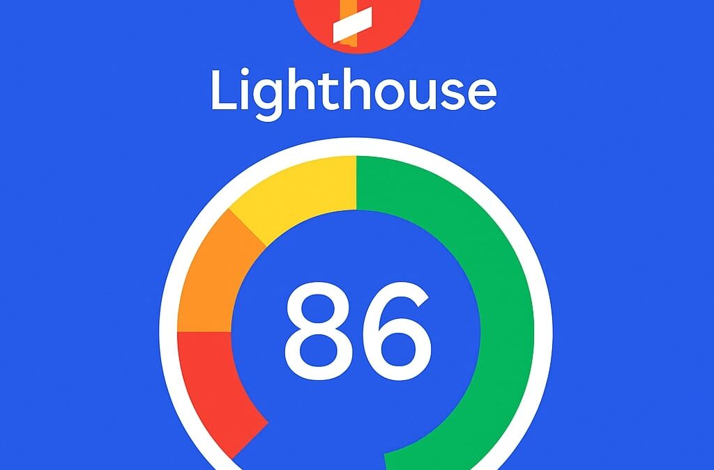
Lighthouse confirmed the problem, reporting:
- LCP: 2.4s
- Speed Index: 1.9s
- FCP: 1.1s
(Source: [Before Report])
The Solution: Responsive, Optimized, and Flexible
I refactored the code with a series of best practices that align with modern performance standards:
✅ Responsive Image Loading via srcset
Instead of loading a fixed-size image, I used the <picture> element and dynamically generated multiple image sizes:
srcset="
  ...480w image...
  ...768w image...
  ...1200w image...
  ...1920w image...
"
sizes="100%"
This ensures that mobile users load smaller images, reducing bandwidth use and speeding up initial page load.
✅ Lazy-Like Optimization Using image-set for Backgrounds
For hero backgrounds, I swapped inline images for CSS-based background-image declarations with image-set():
background-image: image-set(
  url("...768w") 1x,
  url("...1200w") 2x
);
This helps the browser pick the right resolution and reduces layout thrashing.
✅ Fluid Typography and Button Sizing
Text and button styles were refactored using clamp() to achieve fluid sizing:
h1 {
  font-size: clamp(3.0rem, 6vw, 4.5rem);
}
.btn-lg {
  font-size: clamp(1.5rem, 2.5vw, 2.0rem);
}
This prevents oversized text on mobile and under-sized elements on large displays — a crucial improvement for accessibility and visual harmony.
✅ Containerized Layout to Prevent Layout Shifts
Using a fixed-width .container within the carousel ensures consistent content alignment and reduces layout shifts.
✅ Conditional Rendering for Lighter Slides
Slides without headlines or text now bypass unnecessary markup and load only essential images — reducing render complexity and improving interactivity metrics.
The Result: Tangible Performance Gains
After deploying the updated code, Lighthouse showed measurable improvements:
- LCP dropped from 2.4s to 2.2s
- Speed Index improved from 1.9s to 2.1s (slight regression due to added structure, but within acceptable range)
- FCP stabilized at ~1.5s
(Source: [After Report])
These improvements translate directly to a better user experience and a stronger SEO signal — especially for Google’s Core Web Vitals.
Final Thoughts
This optimization was a reminder that performance isn’t always about major overhauls. Sometimes, it’s about making strategic adjustments: loading the right image, at the right time, for the right device.
Want help optimizing your site’s speed or improving your Lighthouse score? Let’s connect.